Restify 2.0
A design prototype for an iOS app helping people with mild Carpal Tunnel Syndrome prevent symptom progression.
Overview
Restify 2.0 is an iOS application designed to support individuals experiencing mild Carpal Tunnel Syndrome (CTS) by helping them prevent symptom progression through early intervention and increased rest. The app provides gentle reminders to encourage healthy habits, guided video tutorials for exercises and ergonomic advice, and a pain log to track symptoms over time.
This version represents a significant evolution from the initial Restify concept, with a more clearly defined solution, refined UI/UX for each screen, and a cohesive design system built to align with Apple's Human Interface Guidelines.
Project Goals
This project was created during the Apple Developer Academy as part of a design challenge focused on learning and applying design principles. Our team of five worked collaboratively as designers over 2 weeks to transform an initial solution concept into a well-defined, interactive prototype.
The challenge was personal for us—one of our team members experiences CTS, so we were building a solution for ourselves and others facing similar struggles. Our goal was to create an app that felt intuitive, supportive, and aligned with Apple's design standards.
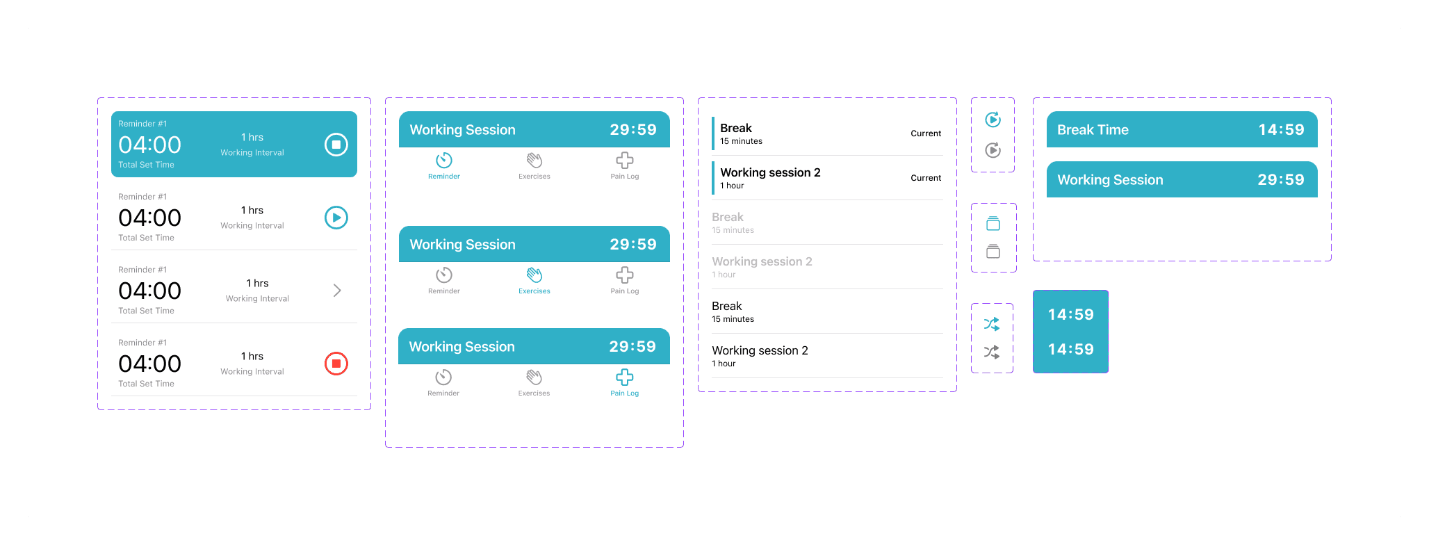
Screenshots

Challenges and How We Overcame Them
One of our biggest challenges was deciding how to display the timer while users navigate through the app. We debated extensively: should the timer always be visible? What happens when it's clicked? Should it overlay other screens or live in a fixed position?
Through this process, we learned an important principle from Apple's Human Interface Guidelines: each screen should focus on one primary task. While this simplified our approach, it also made it harder to decide where certain features belonged. We had to let go of some ideas that didn't fit cleanly into this framework, which was difficult but ultimately led to a cleaner, more focused design.
On the technical side, our main challenge was mastering Figma's advanced prototyping features. We wanted our prototype to feel interactive and realistic—timers that actually run, buttons that respond to clicks, and smooth transitions between screens. To achieve this, we dove deep into Figma's component variants and variables, which allowed us to create a dynamic prototype without duplicating dozens of screens. This made our design file much cleaner and more maintainable.
Learnings
This project taught me the value of design constraints. Initially, Apple's HIG felt restrictive, but it ultimately helped us make better decisions by providing a clear framework to work within. Learning to balance user needs with platform conventions was a valuable lesson in designing for real-world ecosystems.
I also gained hands-on experience with Figma prototyping—specifically how to use variables and component variants to build interactive, realistic prototypes. The ability to make our Figma prototype feel like a real app was incredibly rewarding and made our design presentations much more compelling.
Beyond the technical skills, I learned the importance of designing for real users. Having a team member with CTS gave us firsthand insight into the problem, which made our design decisions more grounded and empathetic.
Attributions

From Left to Right:
- Joycelyn Eugenia Kurniadi: UI/UX Designer
- Muhammad Daffa Ashdaqfillah: UI/UX Designer
- Darrell Cornelius Rivaldo: UI/UX Designer
- Gabriele Wijasa: Mentor
- Euginia Gabrielle: UI/UX Designer
- Java Kanaya Prada: UI/UX Designer